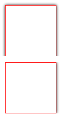
One side shadow in CSS

As You may suppose, there isn’t a standard way to set the box shadow for only one side of the box or leave one side of the element without a shadow. But You can reach it by using simple CSS tricks. Here You can analyze two examples.
In the first example, we will set box-shadow for only one side of the box.
In the second sample, only one side of the element will be without a shadow.
I hope everybody will understand this CSS so I won’t provide any other description. More code, less water)
Let’s start:
One side shadow
<div></div>
|
div { margin: 30px; height: 100px; width: 100px; position: relative; overflow: hidden; padding: 0 7px 0 0; } div:before { position: absolute; content: ' '; top: 0px; right: 7px; bottom: 0; left: 0; background-color: transparent; box-shadow: 0 0 5px black; border: 1px solid red; } |
One side without shadow
<div></div>
|
div { margin: 30px; height: 100px; width: 100px; position:relative; overflow: hidden; padding: 7px 7px 0 7px; } div:before { position: absolute; content: ' '; top: 7px; right: 7px; bottom: -7px; left: 7px; background-color: transparent; box-shadow: 0 0 5px black; border: 1px solid red; } |
This is quite innovative, unfortunately Internet Explorer 9 does not support this.
I’ve just tested in IE9 and it works on my side. Try to use “Browser Mode: IE9″ and “Document Mode: IE9 standards”. You can select this by F12.
It doesn’t work by default because in my WordPress theme there’s a meta tag which switches to Document Mode of IE7:
I’ll try to fix it.
OK, I’ve commented this meta tag and now it works correctly.
I’m going to use this on a web site I’m working on right now, Thanks.
By using both :before and :after I was able to put shadows on two edges of a box.
Thanks, that’s a great trick! Here is the second example in a jsFiddle: http://jsfiddle.net/BxE42/
I think to make the numbers add up, you can use these numbers for the div:before attributes:
That’s the padding you have on the div (7px and 0px), minus the border size on div:before (1px). Here is a fiddle for that: http://jsfiddle.net/ymmEf/
[...] One side shadow in CSS3 | Vacheslav Starikov [...]
its not working in IE8 !!
while opening this site in IE8,i am unable to see these drop shadow effects..
give me some suggestion…
Hmmmm this is good. But when you add “content: ‘ ‘;” all DIV is inactive.
Riaz, IE8 doesn’t support CSS3.
Damon, what do you mean “all DIV is inactive”? Could you explain this in more details? I use this approach and everything is OK.
Thanks, that
[...] https://starikovs.com/2011/11/09/css3-one-side-shadow/ [...]
[...] all 4 directions(top, bottom, left, right), I found out an article to make only one side shadow:
Thank you! This was very helpful.
One side shadow sample
div {
border:5px solid #4FFFA1;
padding:30px;
background:#F6FFA1;
width:100px;
box-shadow: 5px 0 2px black;
}
full code: http://www.corelangs.com/css/box/round.html
css shadow
helsy