Archive for the ‘css3’ Category
CSS Text border
Here’s an example of how to implement a border around some text. In this example text-shadow CSS 3 property is used.
1. text-shadow property allows to set a shadow for a one side of text. For example, it’s posssible to set the shadow only for the right side of text. To gain that, the shadow should be with a zero blur size and 1px of horizontal offset.
2. Making a border for a text, we should set a 1px shadow offset for four sides of text leaving a blur size with a zero value.
CSS of the example:
1 2 3 4 5 6 7 8 9 10 |
.test { text-shadow: 1px 0px 0px red, -1px 0px 0px red, 0px 1px 0px red, 0px -1px 0px red; font-size: 400%; font-weight: bold; color: yellow; }? |
Here’s how it looks in your browser:
Text with border!
Try it here http://codepen.io/starikovs/pen/tzFxK.
One side shadow in CSS

As You may suppose, there isn’t a standard way to set the box shadow for only one side of the box or leave one side of the element without a shadow. But You can reach it by using simple CSS tricks. Here You can analyze two examples.
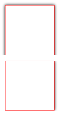
In the first example, we will set box-shadow for only one side of the box.
In the second sample, only one side of the element will be without a shadow.
I hope everybody will understand this CSS so I won’t provide any other description. More code, less water)
Let’s start:
One side shadow
<div></div>
|
div { margin: 30px; height: 100px; width: 100px; position: relative; overflow: hidden; padding: 0 7px 0 0; } div:before { position: absolute; content: ' '; top: 0px; right: 7px; bottom: 0; left: 0; background-color: transparent; box-shadow: 0 0 5px black; border: 1px solid red; } |
One side without shadow
<div></div>
|
div { margin: 30px; height: 100px; width: 100px; position:relative; overflow: hidden; padding: 7px 7px 0 7px; } div:before { position: absolute; content: ' '; top: 7px; right: 7px; bottom: -7px; left: 7px; background-color: transparent; box-shadow: 0 0 5px black; border: 1px solid red; } |
ContentEditable outline style in WebKit
As you know, when you make an editable node by setting an appropriate attribute, WebKit selects an editable area using outline. This outline is a border that surrounds the editable content. The editable area is selected only when you set focus on it, in other words, when contentEditable attribute has been set to true. To change styles of this outline we have to use CSS rules. There are limited amount of styles that can be changed for the outline of the editable area. They are:
- Color (the same as border color)
- Width (the same as border width)
- Style (the same as border style)
Ok, let’s test!
Using CSS3 rounded corners in practice
In this article, I am going to test CSS 3 rounded corners. I do want to know can I use them in practice in different browsers. Here are some examples of CSS3 rounded corners and if you can see some rounded corners – congratulations your browser supports them!
| border-radius: 20px | |
| border-top-right-radius: 20px | |
| border-bottom-right-radius: 20px | |
| border-bottom-left-radius: 20px | |
| border-top-left-radius: 20px | |
| border-radius: 30px 0 30px 0 | |
| border-radius: 10px 30px 10px 30px | |
| border-radius: 20px 20px 5px 5px / 40px 40px 5px 5px |